

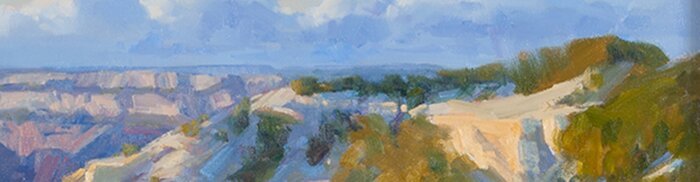
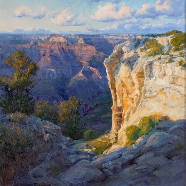
I thought I would write a different post than I usually do. I am writing about my thought process in thinking through my painting, Grand Canyon Glow. Before I started the painting, I knew that I wanted to paint a unique view of the Grand Canyon. I have painted in plein air along the rim and loved the colors in the golden cliffs. I wanted to showcase those colors. So, the idea was born. My view of the canyon is not your typical Grand Canyon painting.
If you have followed my blog for a while, you may have read from me that I have been trying to loosen up with my paintings the last two to three years. The kind of painting that I am really attracted and just LOVE is Russian Impressionism. I love the light, color and thick paint that follows form. That is what I kept in mind as I painted this painting.
First, I painted a rough sketch for the composition. I used two plein air paintings for color and a photo for detail. I found with my small sketch that I had a “hole” of dark in the middle. I didn’t have the taller trees in the painting, just a few bushes. I knew that I needed to make a change there. Next, I blocked-in the painting using a 3 to 4 inch house painting brush. The painting is 48″ x 48″, so I need a large brush. The larger the painting, the larger the brush. I kept the paint thin for the block-in. I found that I have much more control of the thick paint when I start with thin first, so that I absolutely know where I’m going with the painting.
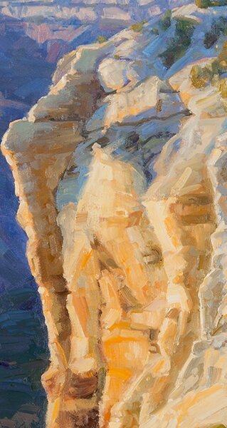
My block-in didn’t have much form for the clouds. At this point, I drew them in a little more definitively. I knew that I wanted less going on with the clouds on the left side of the canvas. I like to have mountains, background, or in this case, the cliff, have some soft and some hard edges. If you look at the detail below, you will see how the distance of the cliff and the trees blends into the clouds with the soft edges. I brought some of the sky color into the grand canyon and trees. By doing so, it helped to integrate the cliff into the background. It didn’t have a “cut out” look to it. You can also see the brushwork following the form at the top of the cliff.
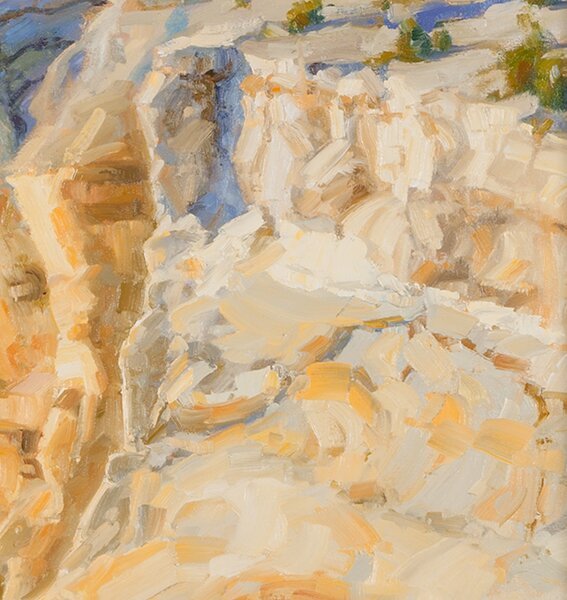
I painted a few strokes of my lightest and my brightest color, the orange, on the cliff. That gave me a reference point for all the colors in my painting. All the following strokes would be darker (except the clouds) and all oranges would be less saturated. The light also gave me a reference for the shadows in the cliff. The cliff is a light color overall, so the shadows are lighter than the shadows in the trees. If you look at the shadows in the cliff below, you will see that they are cooler closer to the sky. Squint at the cliff, you will see light and dark with very little difference between the values within the different colors and the same with the light. You want to make sure that you keep the range very close in the shadows and in the light.
When I started on the “typical Grand Canyon” formations (the warm colors in the background), I painted the shadows in first from cooler in the background to warmer in the foreground. I left some of the canvas without paint in the reddish areas. My first stroke of paint in the reddish parts of the rock formations was the most saturated red color in the closest formation. I then knew that my colors on the formations farther away needed to be somewhere between the background blue shadows and the most saturated color of these formations.
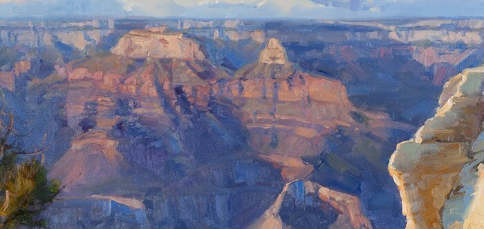
My brushstrokes played an important role in this painting. In the plateau (below), I used a large brush in horizontal stokes to mimic the flat top of the plateau. My brushstrokes on the cliff, especially the thicker strokes in the light, follow the contours of the rock formation. The rock faces that faced the sky are cooler in color that the vertical planes, again because of the sky reflecting into the top planes. In some places, like the trees, edges are softer than the rocks. The foreground rocks, like the cliff, have brushstrokes that follow the forms of the boulders.
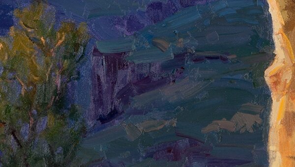
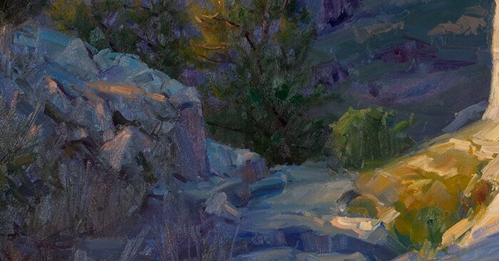
Below, you will see the painting in progress. At this point, I noticed the shape of the light cliff. It had a square shape at the bottom that I needed to change at some point. I changed this by changing the values and the temperature of the shadow rocks, so that the light blended into the shadow more. The value of the bushes at the lower part of the cliff also are close in value to the foreground boulders which helped to change the shape of the bottom of the light cliff. As I added more paint, I also changed the shapes of the foreground boulders and added more bushes in the lower left corner. By painting soft edges in the lower left corner, that turned your attention away from that area and helped to direct your eyes to the light cliff.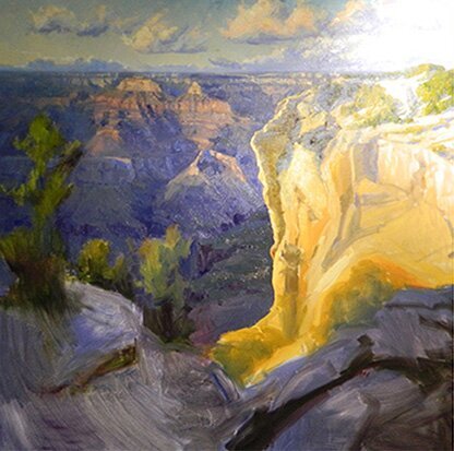 To blend the shadow and light areas, I added some of the orange to the blue shadows, keeping the shadows warmer next to the light. That gave a feeling of a glow from the light cliff. I felt that the warmer shadow was a little green, so I added a very small amount of alizarine crimson to this warmer shadow to get rid of the green tinge.
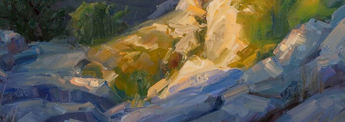
After painting the foreground rocks, I added a little light “dancing” across the rocks toward the light cliff. The light spots became brighter and more saturated closer to the light cliff, but never as light or as saturated as the cliff. This relates to music, building a crescendo. The light also “dances” across the tops of the trees creating some light in that dark “hole” in the middle that I was concerned about in the beginning.
This was a painting that I took my time and really thought through. Some other thoughts in creating this painting follow.
- Grouping some of the trees together
- Using some of the trees at the top of the cliff to help create form, following the topography
- The ratio of complementary colors, blue and orange, approximately 2/3 to 1/3
- Simplifying the typical “grand canyon formations”. I didn’t want them to overshadow the cliff on the right.
- Some of the sky is kept simple without clouds and those that are there are simplified. I didn’t want it to be a sky painting.
- Grouping some of the lights and darks to keep the composition strong
- Making sure that my lights were light and shadows were shadows. I didn’t go too far adding lights in the shadows.
- The bushes on the left and the foreground boulders have very little detail, which keeps your attention going to the light cliff.
I hope that some of these thoughts about this painting, give you something to think about with your own paintings. Happy Painting, Becky
Thanks Becky for the detailed thought process, we really appreciate your sharing. Always looking forward to seeing the fruits of your hard work.
Horst
Thanks for the note Horst. I’m glad the post was useful for you.
Thank you Becky for being so generous with your information. I too love the Russian painters.
Thanks Anita for your comment. I treated myself to a new book last fall on Russian Impressionism